Youtube video
I thought I’d do a write up re-mastering my old TJMod map from ET into ProjectRIK. I say re-mastering because a straight conversion wouldn’t work the physics are too different. However, I liked the flow and concept of the old one, even though it was ugly as sin. I think direct map ports are lazy, at least with this effort was put in to make sure it was optimized for ProjectRIK.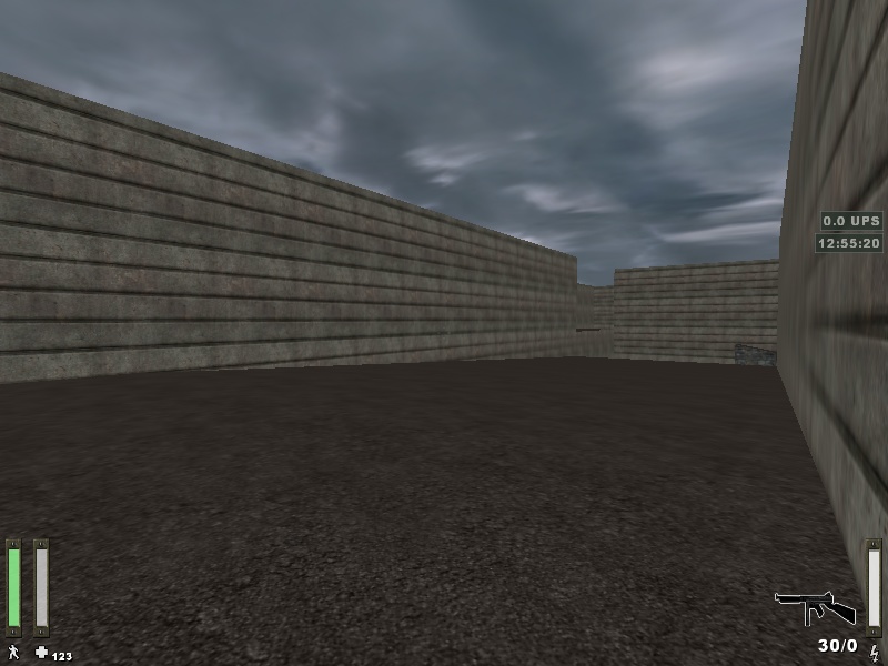
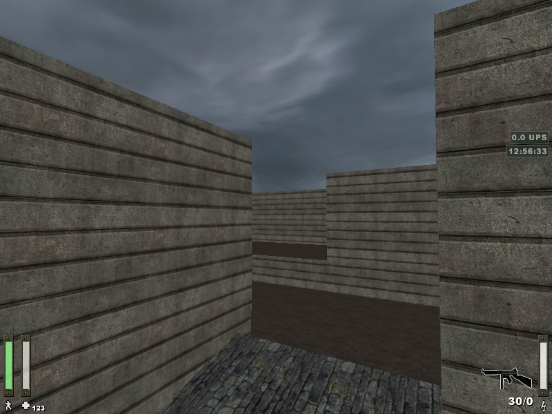
 So I started out with a converter I found online. This would convert my old ET.map file into the new format that ProjectRIK radiant uses (Quake 3 to Doom 3 .map format). This worked well except for a small issue with one of the brushes. I believe this was due to an error in my old map. Manually editing the new map file and finding the empty / corrupted brush fixed my issue (radiant told me where the issue was in its error message). So after that I started working on making the map sexy! A nicer skybox and some modifications to the nasty textures / walls and I ended up with this
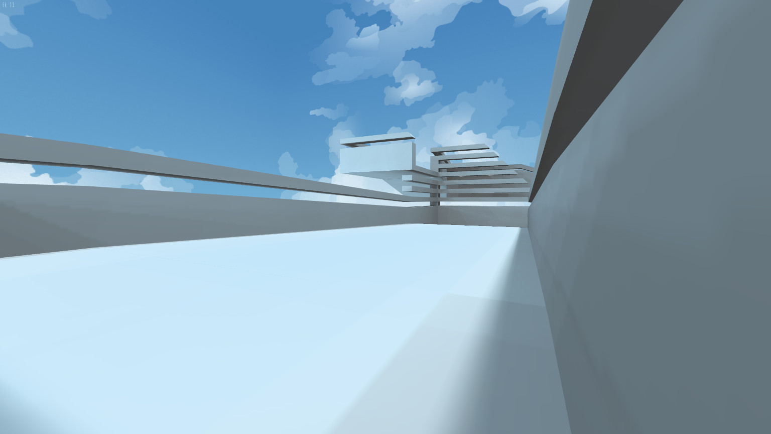
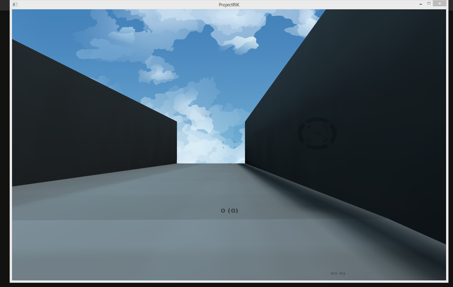 I felt the walls were too high so I started messing round with making them small and look nice.
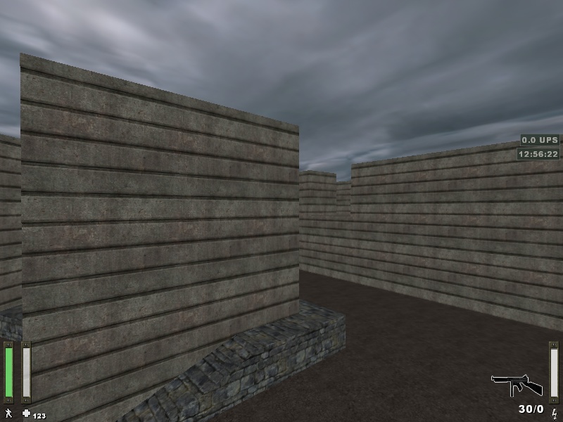
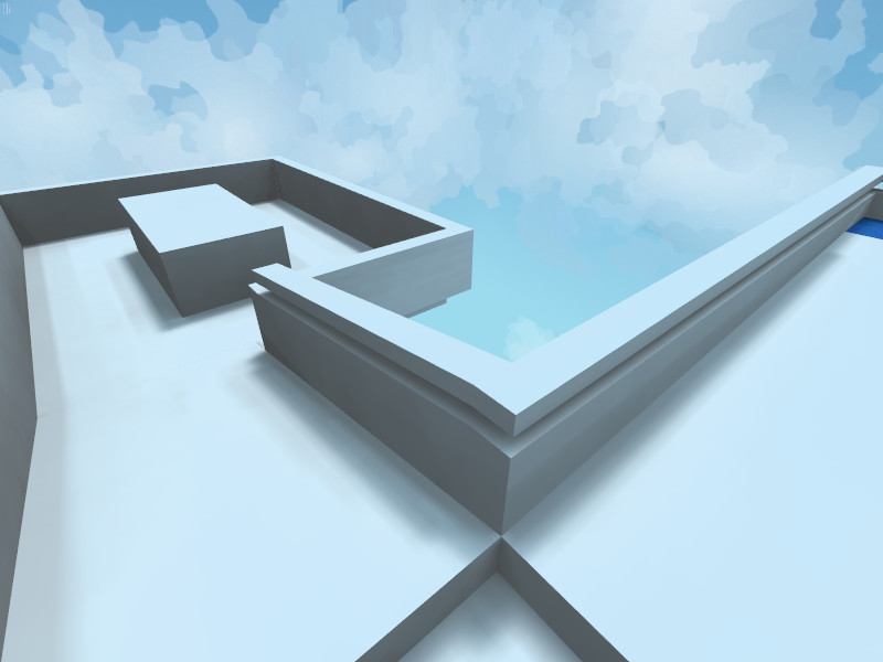
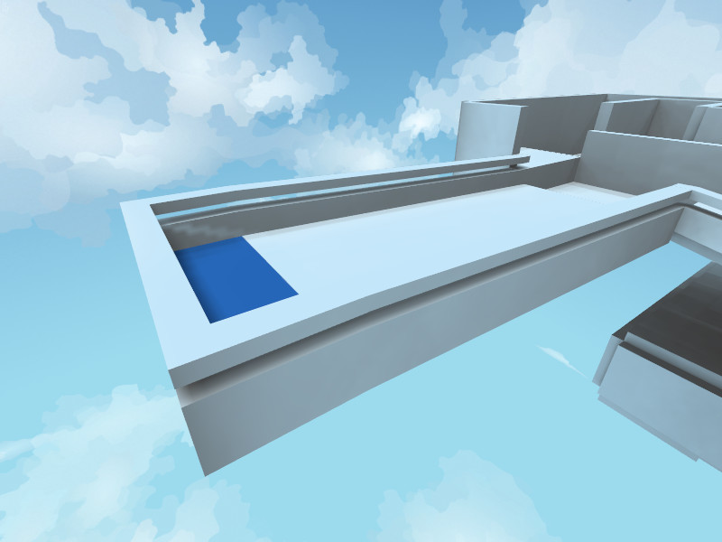
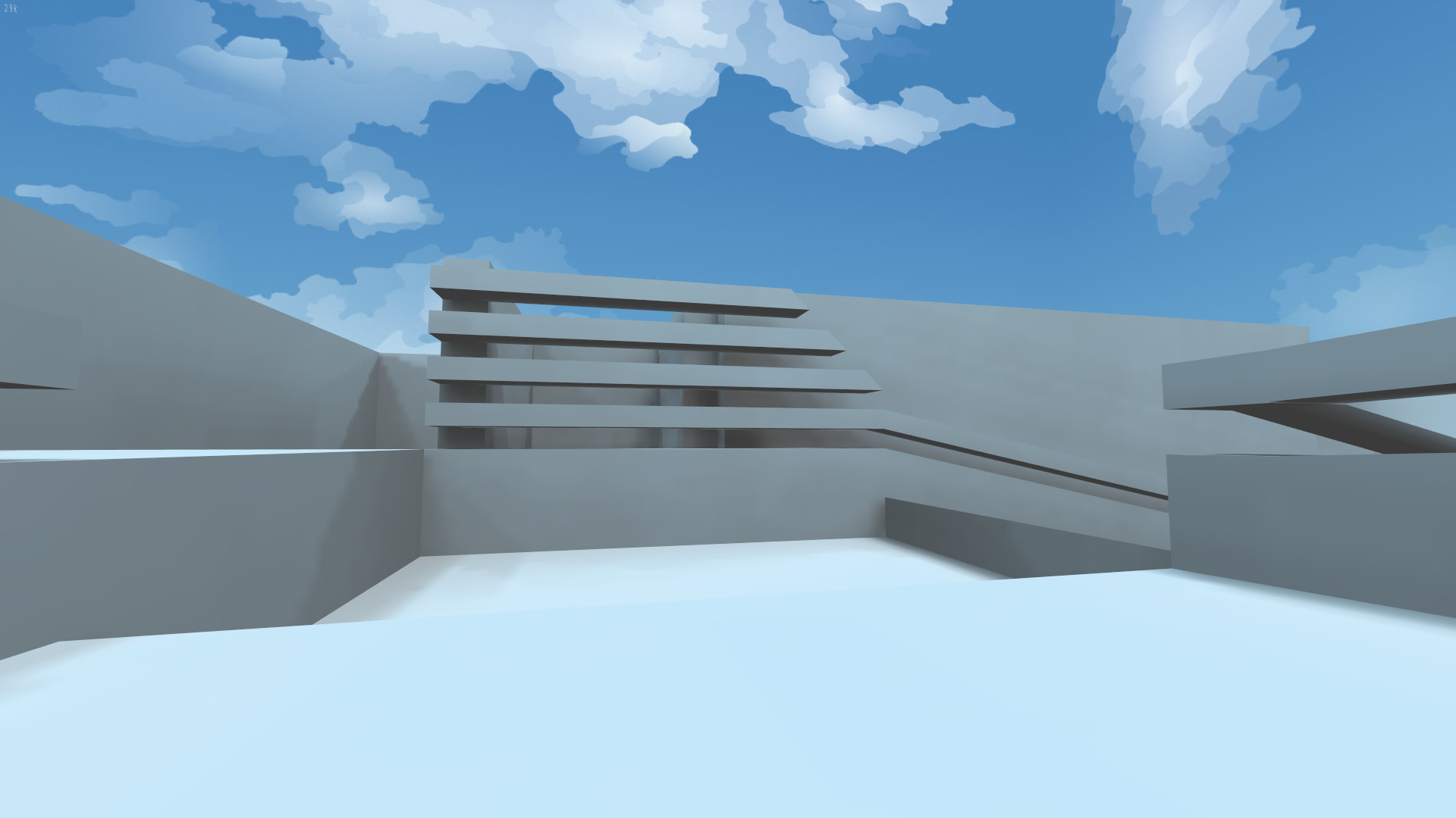
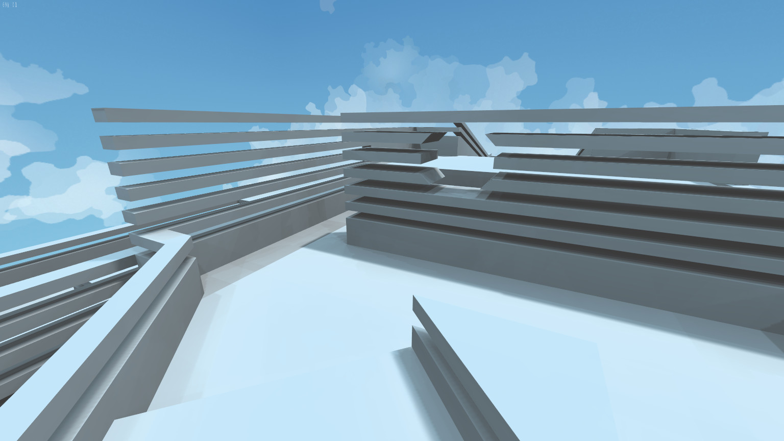
 I then started to do a lot of work on the ramps. My old way of doing them was gigantic triangles, which didn’t look very good from underneath (and with the new design you would be able to see underneath). So I spent a lot of time re-working the slopes and railing to be smaller, look nicer and so that the slopes all had the same gradient (i.e., railings, walls and floor are all the same gradient).
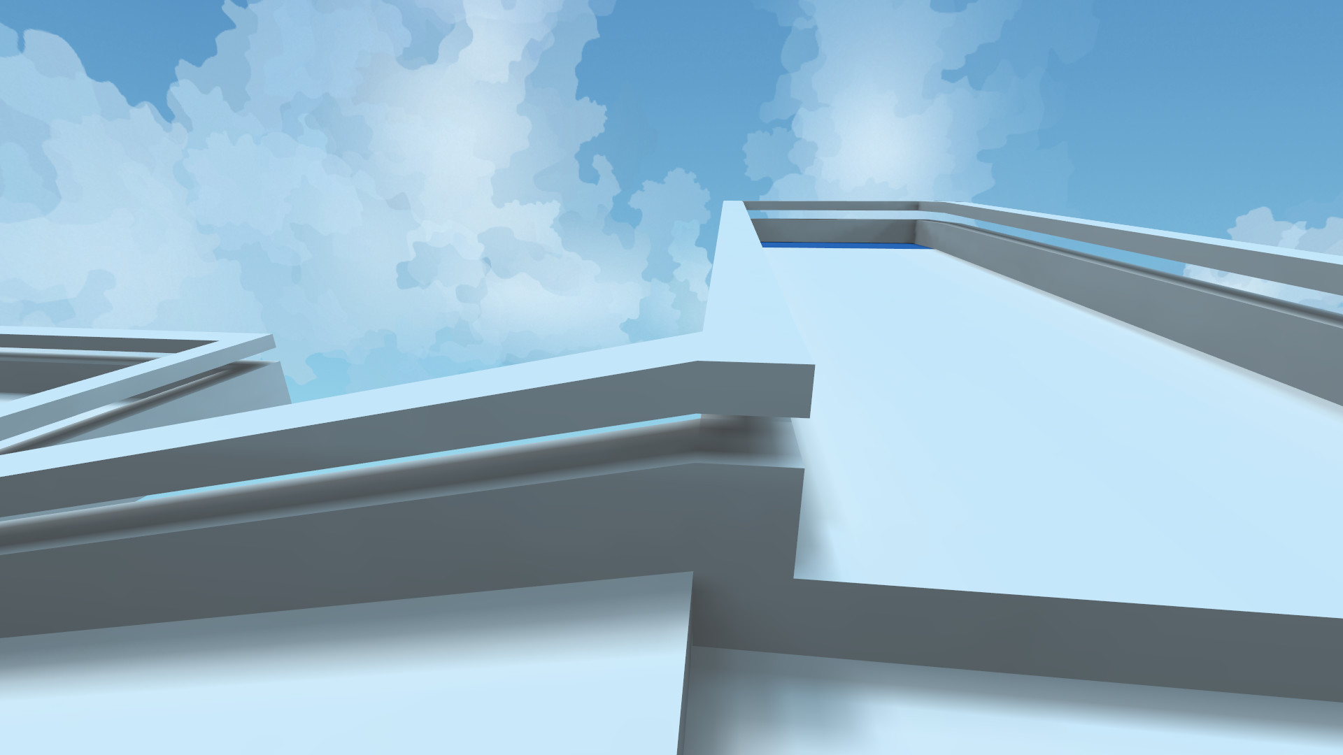
 I then realised that with these small walls, the corners could be cut and with the map layout this could be a huge problem. So is tart experimenting with a few ideas to stop people cutting too much of the map.
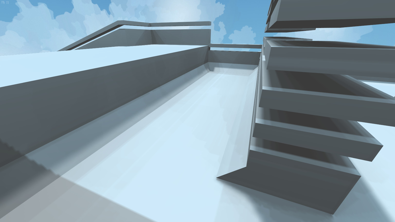
  I like this one, but thought id see how it look all the way around. Turns out it was overkill and looked horrible.
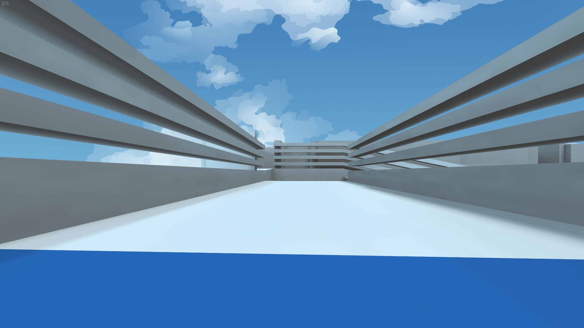
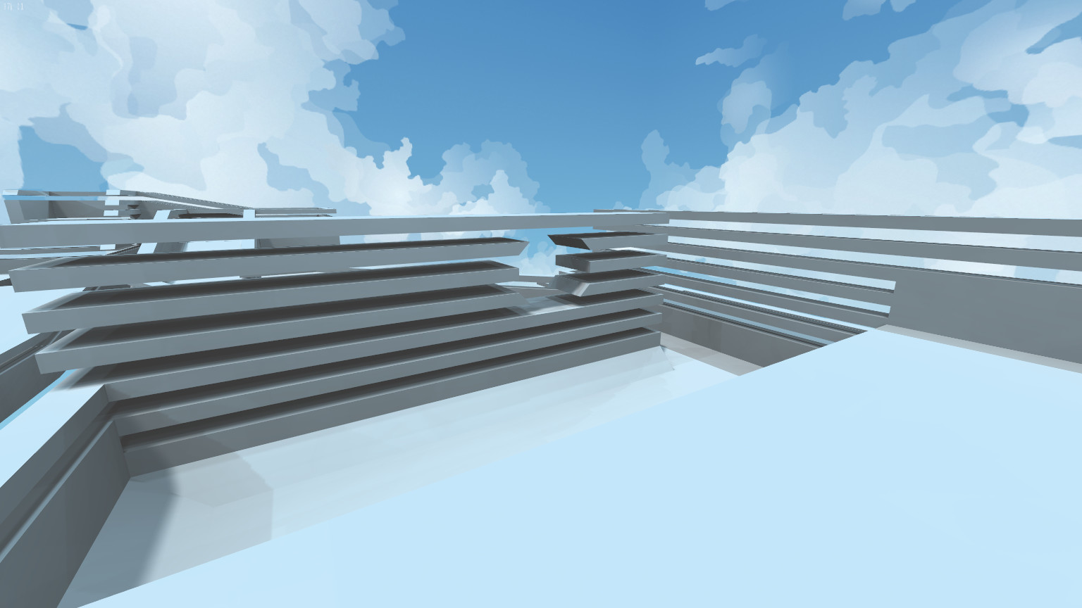
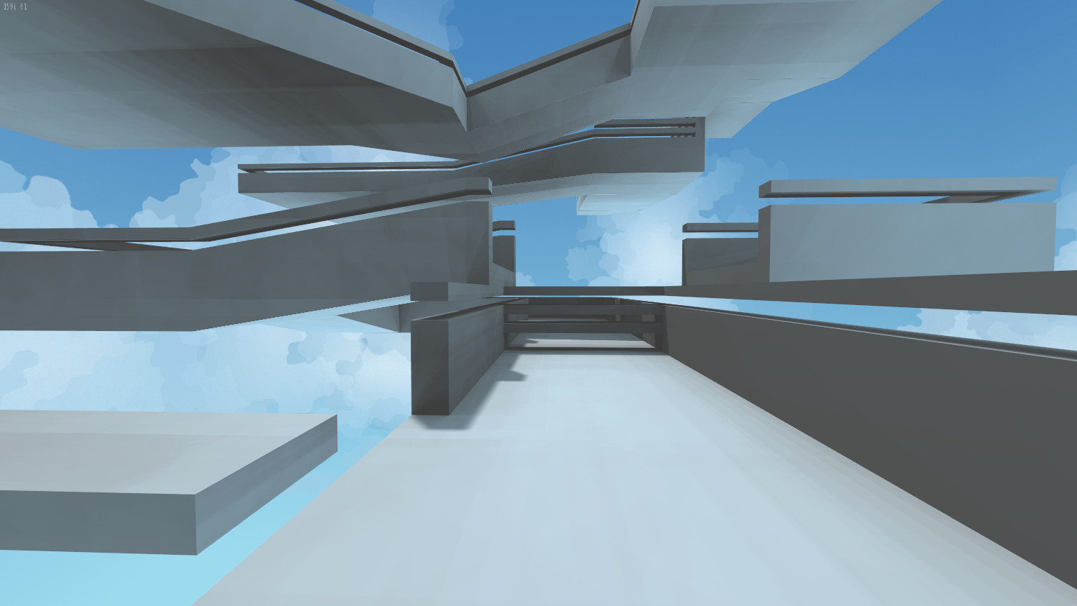
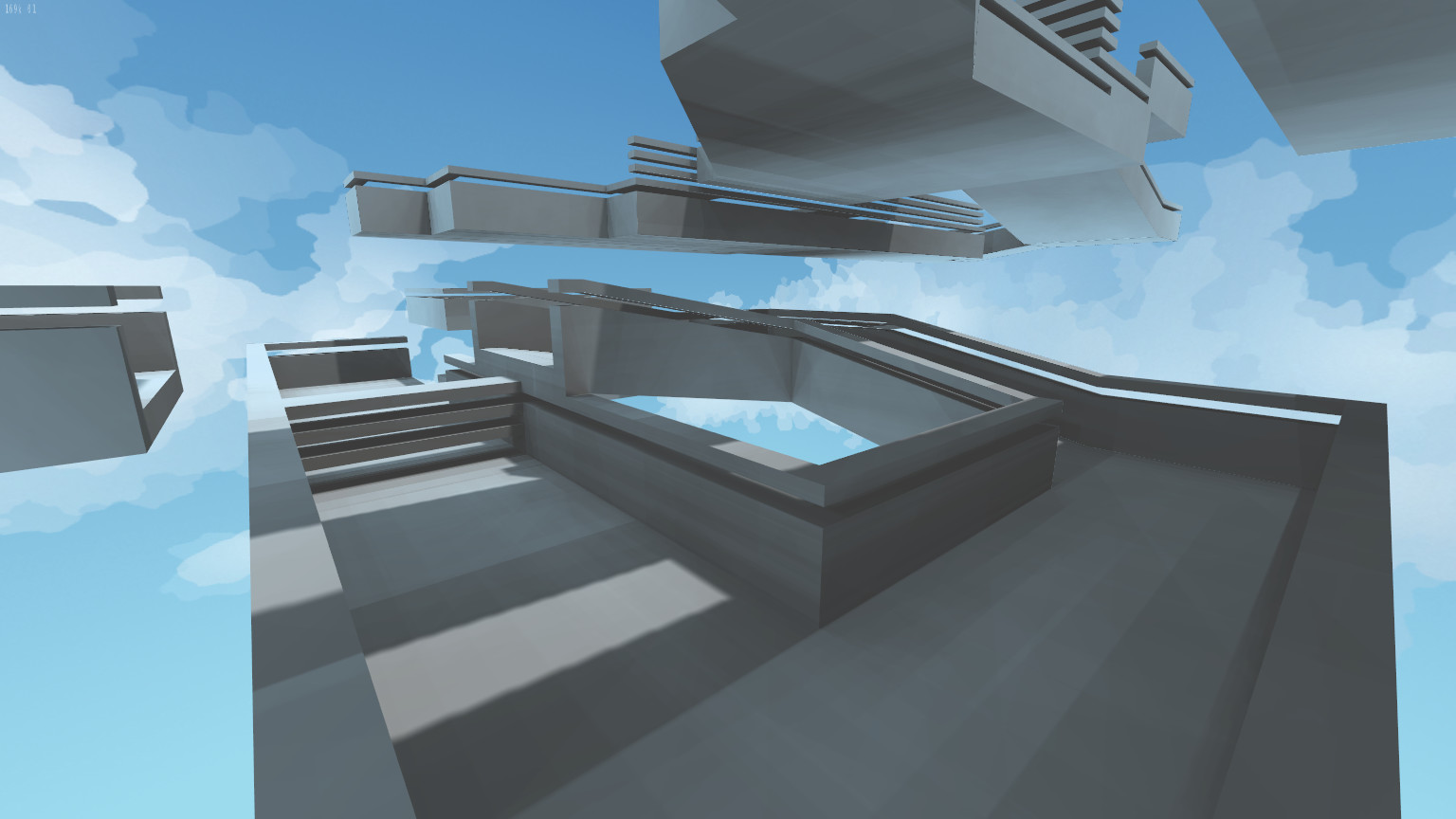
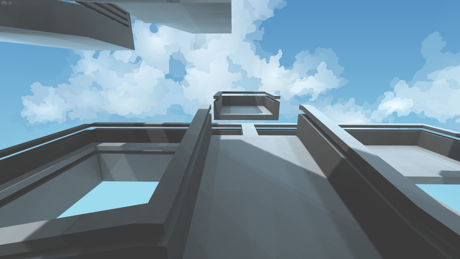
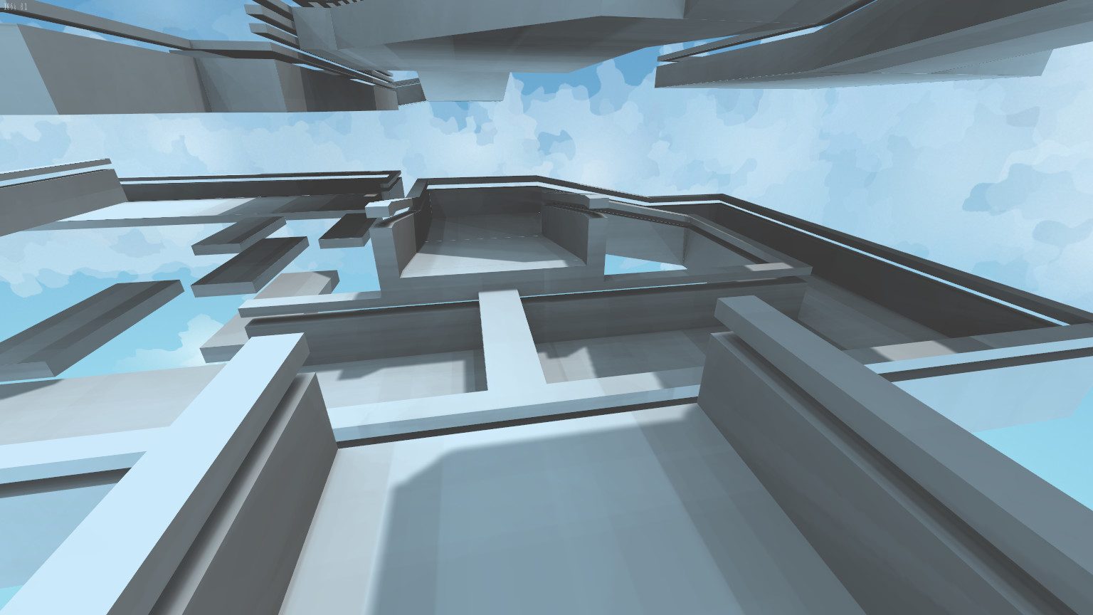
 I settled on the above as I thought it looked nice, served its purpose and fit with the rest of the map. The only problem with this idea was it didn’t really fit with ProjectRIK’s physics, movement and tricks. So to support the ProjectRIK slope running, I raised the platform up.
 Now that everything was raised up in the air, I was faced with the prospect of completely changing the map. This worried me as I wanted to keep true to the original. I decided to try and match up with the next section in a very similar way, just include some slopes to get me there. This way the rest of the map would be at the same height and I wouldn’t be mass moving everything around. You can see the differences of the next section below. In the first pic you see one small slope coming down from the right. Flowing round in a nice right hander into a little left. In the second pic you’ll notice that the slope to the right is almost the same. The right hander is a lot tighter. And the left/straight part after is now on a slope.
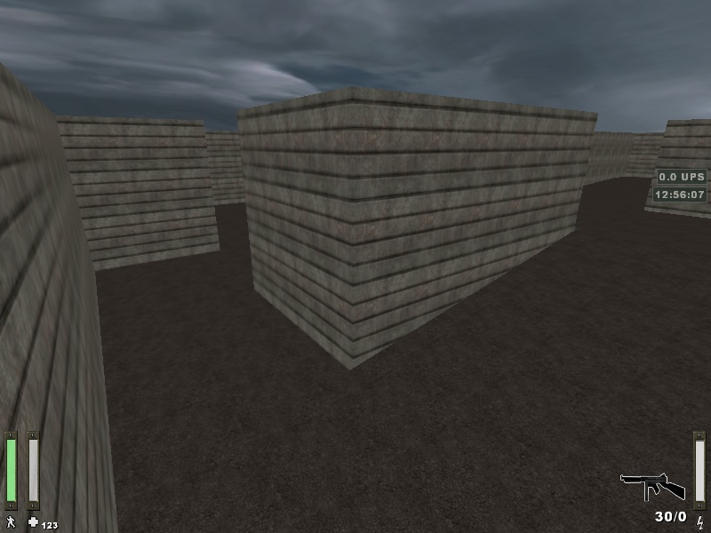
 This next section is one of my favourite parts of the map. I tried very hard to balance this and make it work in the original. There are two ways to complete this. Firstly ramp up off the box and through the hole in the wall. The second over the raised section and up another ramp round the corner (3rd image below). Because I spent so long on it I didn’t want to break this area too much. However, it definitely needed re-working for ProjectRIK.
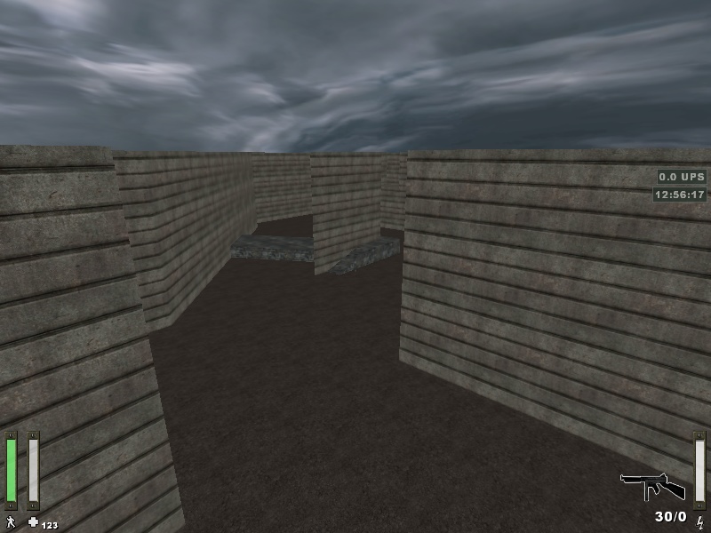
 And here’s the reworked version. Still keeping very true to the original, but reworking the walls and slopes to make it all a lot nicer. The box kicking for the hole is no longer needed and I modified the “round the corner” ramp to be a bit nicer.

 So, now onto the next section. I decided to remove the step at the end of the ramp and change the ramps again so that all gradients match.
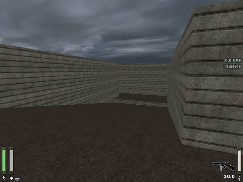
 Next onto the block section. This section had multiple ways to complete it. One really obvious route and one not so obvious, and others. None were necessarily quicker but I imagine the straighter route is best. I just made everything match then nudged things around a little. This section is virtually the same.
 The next section is where things started to change quite heavily again. I made the sections not so wide, as well as removing the ramp and the ramped landing area. I opted with a set of dice style gamma pads to replace it with. This way no matter what speed you should be able to make it over. Shortened and slightly moved landing areas:
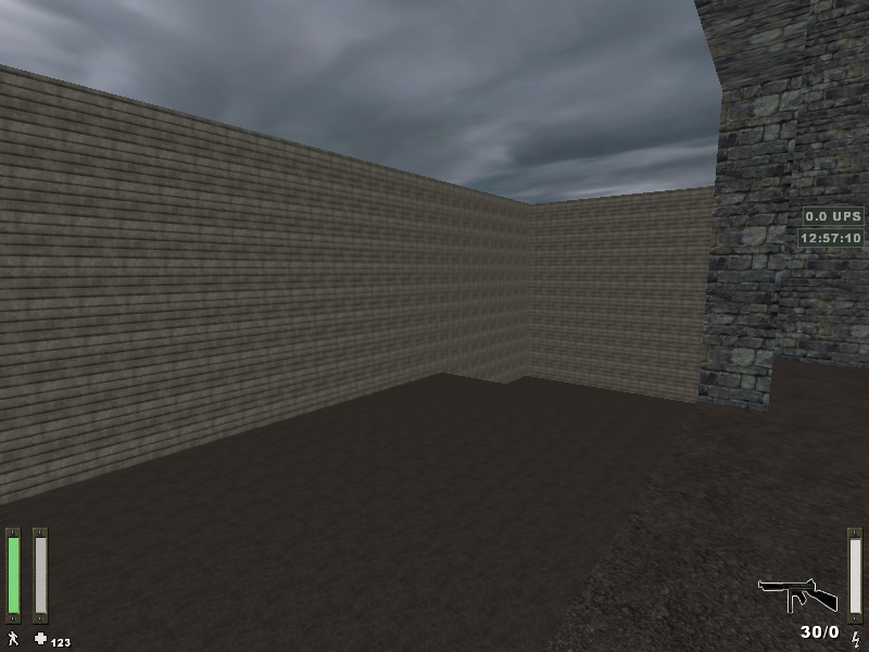


 And the removal of the ramp and replaced with gamma style pads.
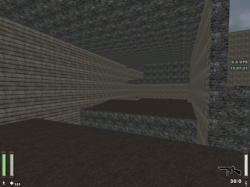
 For the final section, I really didn’t like how things were shaped. Everything was off grid and it was hard to judge as it was all diagonal. It made for a sloppy finish (and no one likes that eh?). So, I started by adding a crouch slide. I decided something was needed in this section and figured this was a nice way to add some new PorjectRIK features in.
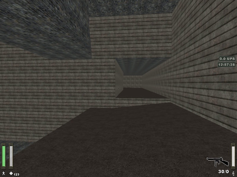
 More fixing to the shape of the map to get rid of this nasty diagonal wall.
 Then finally onto the finish.
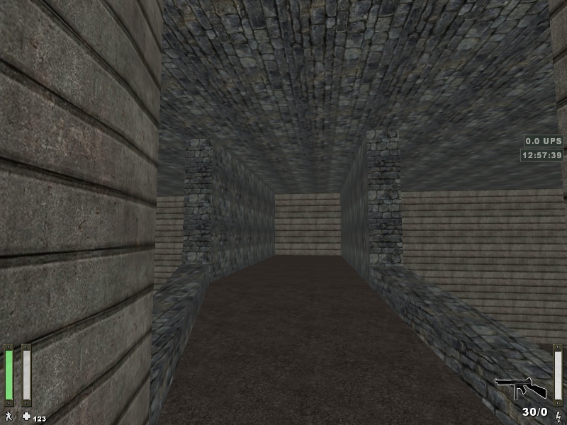
 I then went through added checkpoints in places which help to stop people cutting the course, these basically go hand in hand with the high walls (as even the high walls can be bypassed and i dont like invisible walls). I need to do some small changes to the dice gamma pads just for balancing and add some special textures to help with wall jumps in certain places. However, for the most part it is complete. I am really happy how it’s come out. I believe i kept enough of the feel of the orginal while changing bits and pieces to match up with ProjectRIK's physics and movement. I hope everyone takes this stance on bringing their maps to ProjectRIK. Ports of maps are cool but hopefully we will see maps being remastered and properly converted to ProjectRIK. You can see the full album of all pictures here and more at this album link.http://imgur.com/a/u46axTheres also so more pics here:http://imgur.com/a/ZVzEN