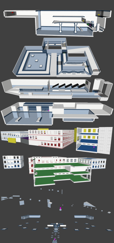
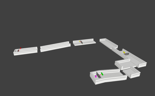
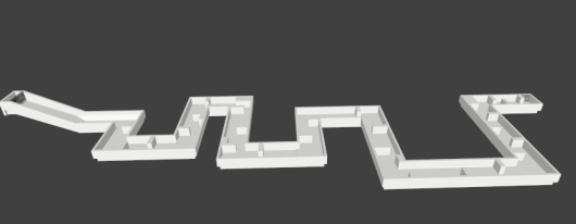
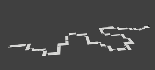
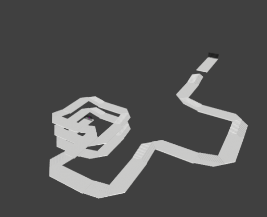
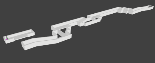
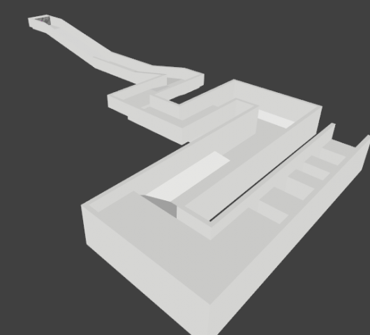
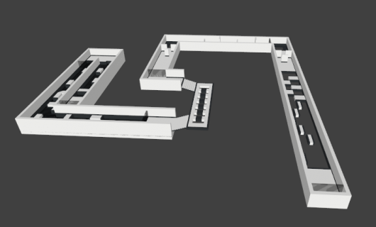
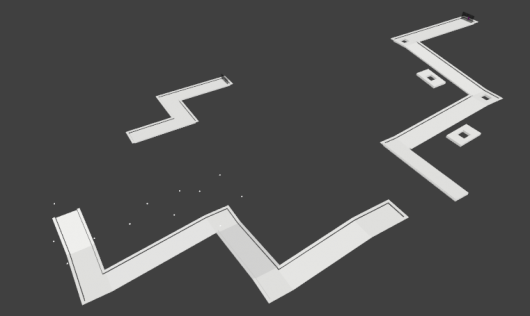
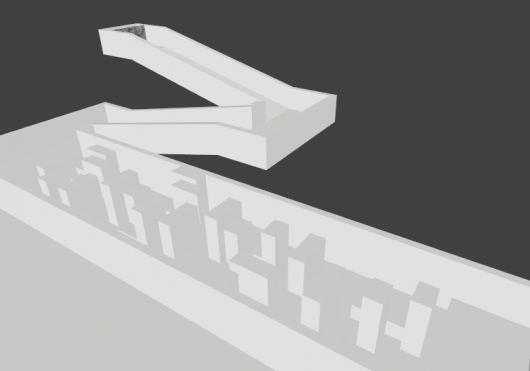
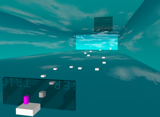
Show here screenshots and discuss your ideas for maps to come.
You start! :D\will post some later..
Lots of people have already seen my map on youtube but I thought I would post with some updated shots and info. YT for those who havent seen it: https://www.youtube.com/watch?v=DuSQoSKx-KYSo the first thing that youll notice in the screenshots is the colour change at the start. Ive been experimenting with some designs. Theres also some small changes in the central section. Then finally youll notice from the screenshots below. Everything after the 0:20 mark in the video has been removed and replace with a new section with a nice little kicker ramp. It was decided it didn't flow very well before and this has a much nicer feel about it. Still very much in progress. I hope to have it finished by the time the month is out.http://imgur.com/e8wSQDZ,kYwqdQb,yMRChGv,CopWqGE![Image]()
![Image]()
![Image]()
![Image]()
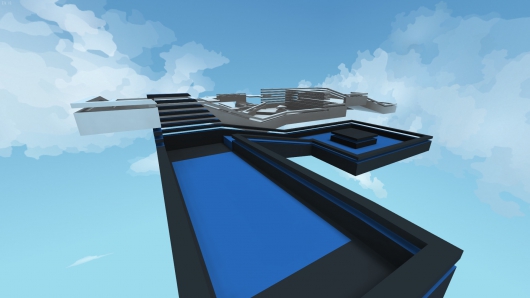
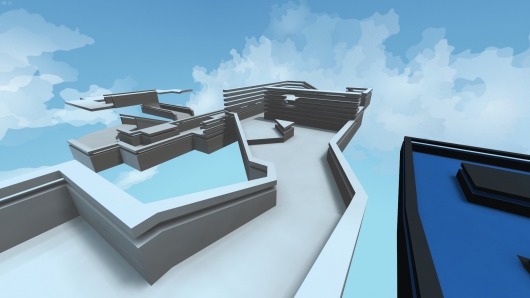
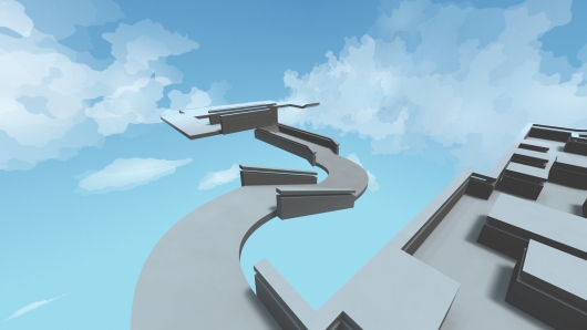
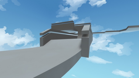
This flat color stuff looks really boring, can't we get any texture at all? Like some pattern or something.
It's not against the rules to use textures, they just aren't included. I can make maps with literally anything I have in Q3, except I think I'd have to remake the shaders.
Textures and shadersStick to the stock textures and shaders, at least for the time being. Any relevant changes or improvements to it, or additional colors\trims\etc should be added to the game files, not to a specific mapby Dinius
From Mapping 101
Do not EVER use Q3 textures in RIK. They are outdated, overused and low quality. There are million texture websites that can offer better textures.@ Stealth, I guess you got your answer via your own quote. Gameplay comes first, you can implement better textures on a later point of the game. Also you can create very good looking stuff with brushwork only too if you have it in you.
Don't go re-theming it again and again. Use that time to make another map. The continuing part looks interesting. I don't like the new theme though, it's too dark for that skybox.
Actually, it IS against the "rules" to use custom textures. There will be added additional "texture sets" eventually, with different themes and such. But everything will be relatively simple/minimalistic. One of the reasons for this is.. Have a look at Spray's map for DFWC. This is a map that has been put a, relatively speaking, huge amount of work into making. Generally speaking this is about as good as these sort of maps can look. Although I think some of his earlier maps looked better, but this isn't an argument about 'oh but this other map with similar style looks better'. And this is in no way meant offensive towards Spray or other Q3 mappers etc. But these maps, although they're impressive for the Q3 engine, look like crap compared to most maps in more modern engines. Due to graphical limitations etc. See some screenshots below of the map if you're unfamiliar with it.http://imgur.com/KyeYyUT,k9q2NJa,9Nat9j0,7BxLXJU,AW23tZn So we could spent large amounts of time making such maps, which will just end up looking, well, unattractive all in all, in the modern world. Not to mention, in RIK you'll be moving at quite high speeds most of the time, so detailed looks like that doesn't really .. matter much. It'll just be passing by quickly most of the time.Again, no offense here, this isn't any sort of thing 'against' Spray or such, this is generally speaking for the Q3 engine, with his map as an example. So, we could do that, or we could use relatively simple textures, and create something a lot quicker and easier, which looks smooth, minimalistic, and nice. Of course not everyone will like this, but there's been a lot of good feedback on the, currently unfinished, looks already, so it's not like I'm alone in my opinion here. It makes it easier for mappers, it gives the whole game a general look/feel to it, and so forth and so forth... Sure, RIK has some more advanced graphical capabilities, but if we start leveraging those features heavily, we'll end up either along the lines of the average modern engines, or Reflex. The average modern engine is aimed around 30-60 fps or something like that, which just isn't relevant. And as far as Reflex goes, sure, but have a look at the recommended system requirements.. i7 + gtx 770. According to them this will be lowered as they add more optimizations etc, and sure, it will, but how much lower.. In any case, the first option just doesn't work very well, I've tried. The second option, Reflex, severely limits the amount of players who can actually play the game properly. Again, this isn't intended to 'put down' anyone, I have absolutely nothing against Reflex, I think it's pretty awesome. This is just my reasons for going 'simple' as opposed to NOT. So yeah, those are some reasons and so forth.. :) On another hand, I don't see how a stone texture or a metal texture is all that more 'interesting' .. :p
When you post like this, it almost appears as if you're mapping actively :o:D
It’s not against the rules to use textures, they just aren’t included. I can make maps with literally anything I have in Q3, except I think I’d have to remake the shaders.by KittenIgnition
You can make them, but they wouldn't be allowed to be played online :)
As said previously what about simple patterns? Lines, grid, dirty looking textures (not 1 flat color).I know you can make lots of stuff with brushes, but most people won't & adding too much detail with brushes is bad for FPS.
I think for the moment we need to get away from the textures discussion. I don't know where dinius wants to go with them but in the current stage of the game, I think it's silly to be worrying about the textures. Maybe for beta release the subject opens up again but I don't think it's relevant at this stage of the development.
Yeah for sure, will have a lot of 'trim' textures, there's some very few of them already. So lines\grid\etc, aka things that make it 'styled" without having to create additional brushes for it. Never intended for it to be only brushes that's required. Multiple sorts of shapes and so forth is coming :) One of the reasons I haven't done it yet, is that I'm contemplating making some sort of a system so you can somehow colorize the trims. As it is now you'd have to make a ton of identical trims in multiple colors. But it would be far better to have something like..1: You have the texture, let's say it's grayscale, 2-3 'colors', like black, white, gray, which is essentially the 'pattern' of it.2: You simply colorize it somehow, by defining the 2-3 colors, which then replaces the original grayscale. Something like this would be perfectly doable without impacting performance. But not quite sure how to make it .. easy to do for the mappers. To avoid using any sort of entities or func_static or alike, the map format would need some modifications, so it'll probably be a lot of work. So for now / the near future, I think it's safer to aim for adding some misc trim related textures the 'normal way'.
The screenshot collage is of maps I started to build roughly 30 minutes before taking shots. I like to work on multiple maps at a time.
You can make them, but they wouldn't be allowed to be played online :)
by Dinius
Nothing is played online anyway, and I never release my maps. I have no problem with my maps not being played by everyone.
